Posts

Showing posts from November, 2021

InDesign Homework 1

 InDesign Tutorial Videos Video 1:   InDesign Shape Tools         This video goes over how to use the shape tools in the Adobe System InDesign. There are two options when it comes to shape tools, the shape tool for framing photos and the normal shape tool. The normal shape tool was the options of: rectangle, ellipses, and polygons. To enlarge the shape that you selected all you have to do is click and drag once you have selected the type of shape you want. This tool seems very self-explanatory and easy to use. I do not think that I will have a problem using this tool. This tool can be used to make background designs for different logos. What I found interesting about the video was how many different ways she explains how to use the shape tool. The teacher also goes through how to use the shape tool with a step by step example of a real design.  Video 2:   InDesign Pen Tool       This video goes over how to use the pen tool to make custom shapes and backgrounds in the Adobe System, InDe

Autoscopy Project

Image
Original Image:  Additional Images:  Artist Statement: This project was one of the harder projects I had to complete this year. Starting off, I did not know what I wanted to do, or how I wanted to manipulate my image. Originally, I was only going to use nature as the images to mask and add onto my own self portrait; however, I wanted to be more original than that. I decided that I would stick with the nature theme, but add on more of an environmental conservation theme. So, I went to course of pollution, greenhouse emissions, and other ideas that revolve around activities that have been hurting the earth. I wanted to portray a contrast between hurting the earth and loving the nature it provides us with. Some of the images I included were of coal power plants, oil spills, smog in India, and trash pollution in our oceans. I also included pictures of flowers, desert floor cracks, the recycling symbol, roots, and leaves. I support environmental friendliness and that is the main reason why

Somewhere Project

Image
  Original Scene Photo:  Original Personal Photo: Artist Statement: For this project we had to incorporate ourselves into a movie, series, or famous photo. I choose to include myself in my favorite film, Good Will Hunting. This movie has always held a special place in my heart, from heart-breaking therapy scenes to the intellectual content, and breath-taking cinematography talent from the director Gus Van Sant. The score of the film is also one of the best parts of the film. I first watched this movie after going on a Matt Damon movie watching spree with my dad. I will never forget the amazing acting that was displayed in this movie both by Matt Damon and Robin Williams.   To start this art piece, I began with watching the movie trying to find a scene that I thought would be easier to edit myself into. A lot of the scenes are shot with complex backgrounds that would be hard to mask and edit myself into. I played with the idea of putting myself onto the movie poster, but I could not fin

Photoshop HW 2

Image
      I think this photo would be really hard to photoshop myself into because, the stretching of the man's face would be hard to recreate with my own. It seems like it would take a lot of work and skill in order to get the hand to look like it is actually pulling at the skin of the photo you layer into the photo. photo from:  https://www.instagram.com/kirbyjenner/?hl=en     I think this photo would be easier for me to photoshop myself into, as well as, it gave me inspire for the next project we will be working on. I like how he made himself almost as tall was the motel sign. I think with the blank sky in the back ground and the size he made himself makes the photoshopping easier to deal with compared to other backgrounds. photo from:  https://www.instagram.com/averagerob/     I thought this photoshop was really funny, crazy how James Fridman can take a photo of a young boy and turn it into such a humorous photo of a "older business man". photo from:  https://www.boredpan

Self Portrait Poster

Image
  This project was created in the Adobe System, Illustrator. This project was a little difficult specially when it came to figuring out was I was going do for the poster itself. I switched back and forth between the ideas of doing a supportive poster for nursing and a poster that encourage wearing masks. I ended up doing a mixture of both since the two topics were relevant to each other. The inscription for these topics came from most of my family is part of the medical field and has been fighting on the front lines of the COVID-19 pandemic since the start in 2020. I choose to keep myself black and white, so that it drew less attention to myself and more attention to the mask and the message of the poster; this is also the reason why I choose the color red compared to lighter more pastel colors. Red symbolizes boldness and courage to me, and this is exactly what healthcare workers express during this time in our lives.  The project started off with me looking through my senior photos t

B&W to Color Project

Image
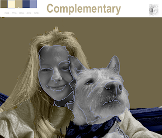
  Original Photo:  Artist Statement:       For this project, we worked in the Adobe system called, Photoshop. The aim of the project was to change a black and white photo into a colored photo based on certain groups of colors. The groups of colors I used were triad, monochromatic, and complementary; all these groups were based in the yellow field. I really like yellow and think that it speaks a little to who I am as a person, so I thought it would be a good choice to color myself and dog with. The picture I choose to change is a picture taken about a year and a half ago of my dog and I. I love this picture because even though it is not seen that well, my dog and I are hammocking in the picture.        This art piece was more difficult than others to complete; I really struggled in the beginning trying to get comfortable with the quick selection tool. Sometimes, it would select too many things and then I would have to go back and cut out some of the selection which would be tedious at s

TagBrush Project

Image
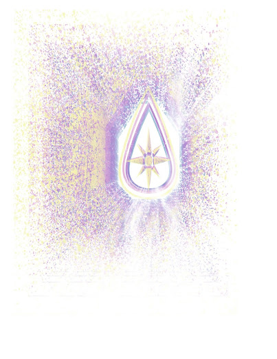
  Original Logo:      This was made in the Abode System, Photoshop. In the system, I used a logo I had created for an earlier project. This tag was made through five different layers; I used a negative, scratches, spray, logo, and background in order to make the original tag. When using the negative layer, I had to position it just right, so that the white streaks of the file would not drown out my logo completely. In the scratches file, I enlarged it, so that I could get a bigger scratch running down the center of my logo. I think that a large scratch really tuned the art into being something that was older and more rustic. The spray I choose was more of a splatter, this was because I wanted it to look more like spray paint down from far away. Also, before making the layers of my tag, I made a path around the logo; with this path, I tried to make it look like it was actually a piece of paper cut to make an outline for a real tag that would be used in street art.      The colors I used