Logo Project
 |
| Logo Project |
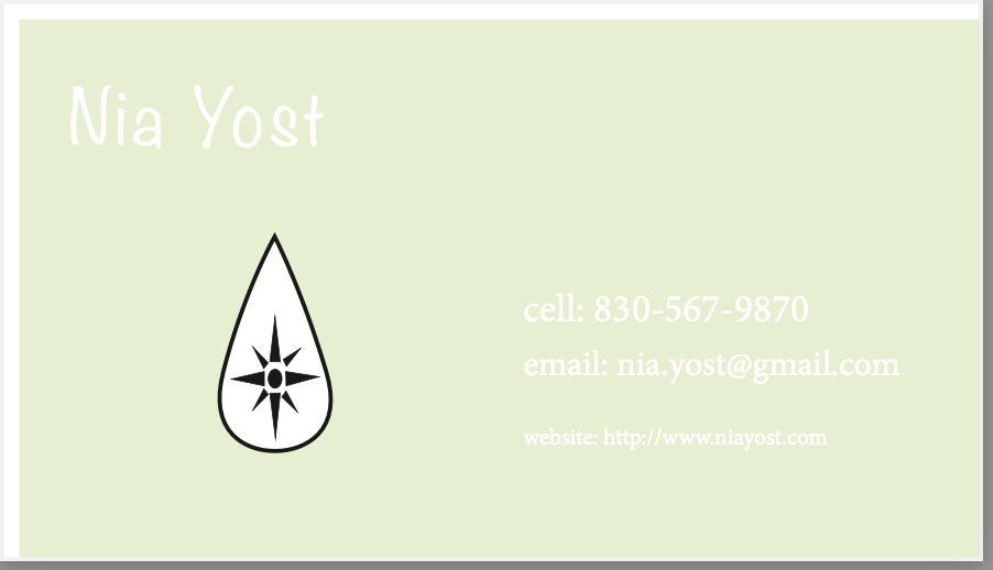
This project was completed on Adobe Illustrator. At first when I was told that I had to make a logo or symbol that represented myself, I was pretty scared of the project; mainly because I could not think of objects that encompassed who I was as a person completely. During the sketch phase of the project, I drew a water drop, ASL "Y"-hand, books, ice cream cone, and the North Star. All of these symbols represented a part of myself or my life that has been super meaningful. I decided upon combining the water drop and the North Star; the star and the water drop represent my relationship with my dad and the years I spent competitively swimming. The North Star connects to the relationship with my dad because we both are people who love the outdoors and hiking, so a large part of the memories I have with my dad are spent outside.
In Adobe Illustrator, I used the ellipse tool, the rectangle tool, and the direct selection tool. The direct selection tool proved useful to be able to get the exact water droplet shape I wanted; this tool also helped converting a rectangle into the triangle shape I needed to complete the north star. I used the grouping option on Illustrator to be able to group the triangles and small circle together in order to form the North Star. This grouping also helped when I was adjusting the size of the star in order for the logo to be seen more clearly from far away. The stroke size of the water droplet was another aspect that I had to play with a little before I realized how large I wanted it to be. Finally, throughout this project I used the arrange option, which allowed me to send certain shapes to the back of the page, or bring specific lines to the front. This project took me about four hours in total to make, this was spilt up over about four days.
During the color logo phase, I went through and researched which colors would be colorblind-friendly. The color combination of orange and black is the best for those who are colorblind. Also, I feel like the orange and black speaks to who I am as a person in multiple facets. One of those aspects is that my high school colors were orange and black, so that ties back to another part of my history; as well as, orange is seen as optimistic and adventurous. These are two traits that I feel like encompass who I am as a person.
Sketch:


Comments
Post a Comment