Business Cards
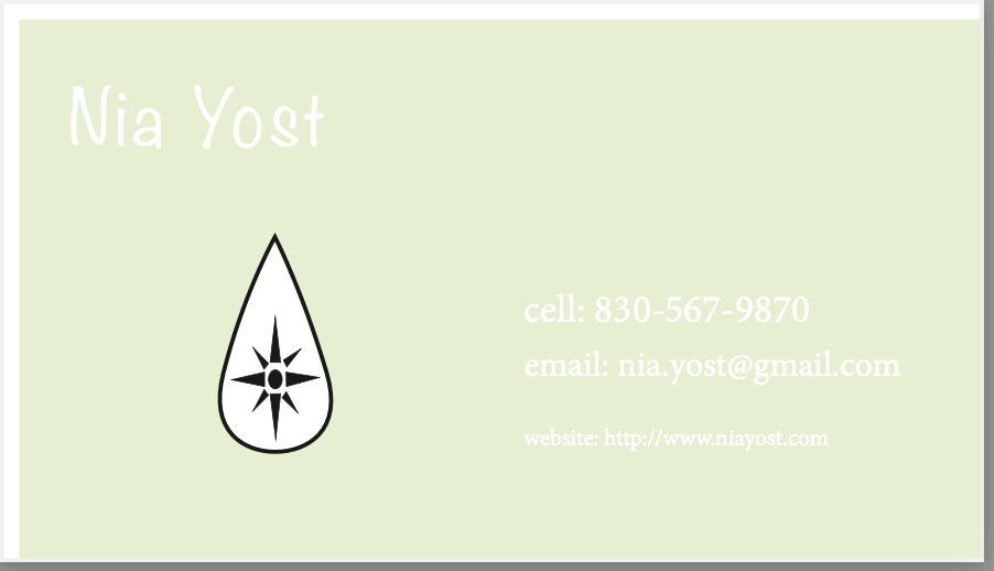


For this project I used the Adobe System, InDesign. Through the tools and applications of InDesign, I was able to make three different business cards. These business cards have a few facets: I included my logo in all three of the cards, my cell phone number is also included, a website to reach me at, and an email. Giving multiple ways of communication is always a good idea when it comes to business cards. I choose mainly pastel colors when designing my business cards. I chose pastel color because I think they worked best with the logo I chose. However, I did make one of the business cards a bright red; I chose red to be one of the colors since it really “pops” out at a viewer and makes it “unforgettable”. I think the black and white logo really works the best with all the colors I chose.
While making this project, I struggled a few times. One of my main problems during this project was remembering which layer I was currently editing on. When I would get mixed up on the layers I was editing, this created a problem of text boxes not working or background colors getting messed up or shifted. The solution to this problem, I double checked the layer I was working on before adding anything new, and I would lock the layers I was not using. Throughout this project I used the frame tool, rectangle tool, and the text tool. Overall, this was a fun project to complete and I think it will be useful in the future career wise.


I really like your business cards. The colors you used are so cute and they really fit well together with your logo. I think you also did a really great job with the professional aspect of the cards as well and they look amazing!
ReplyDeleteYour cards look amazing. The font of all three cards is so cool and go with the vibe of the card. I really like your logo and how it looks like it belongs.
ReplyDelete